
Easy to set up – map associate column with a choice or percentage column, your color settings, and any data in the associated column.
Introduction
Bamboo Solutions’ Visual Indicator Column gives you the ability to display incremental progress, or any other status, in the form of either a color-coded bar or a percentage-based progress bar. This cloud part supports floating tooltip information, custom color sets, and displays percentage information in both visual and numeric form. The tool enables the user to quickly scan through lengthy SharePoint lists at a glance, while still retaining access to the individual list item data.
Installation
To get started configuring your instance of Simple List Search Cloud Part, we'll start by adding the web part to a page. Simple List Search Cloud Part can be installed by following our documentation outlined here: Installing/Updating a Cloud Part for Modern and Classic Pages. This documentation will guide you through the process of adding your Cloud Part to a page, both Modern and Classic.
Configuration
Visual Indicator Column operates in both Modern and Classic environments of SharePoint Online. This guide will be focusing on the modern experience, but any feature or usage that is available in a modern environment is also available in a classic environment. The only difference between the two is the way the user, as an admin, adds webparts to a page, which is a SharePoint OOB difference between classic and modern.
Upon installing Visual Indicator Column Cloud Part® to your SharePoint Online environment, you will see a new webpart available as an option to add to your page. This webpart is called “Bamboo Visual Indicator”, see below for what this webpart icon will look like.
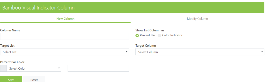
Upon adding the webpart to the page you will get the below webpart on your page:
As an admin you will use this webpart to create and manage all Visual Indicator Columns within a site collection. If you attempt to add a Visual Indicator Column from within List Settings you will not see an option to do so. In addition, after you have added a Visual Indicator Column into a list, if you navigate to your list settings you will see the new column you created and the type will show up as “Single line of text”. You are not able to modify or manage anything but the display name for the column from this area.
There are two options on this webpart: New Column and Modify Column. Below we will discuss what each of these options can be used for.
New Column
The new column tab on your Visual Indicator Column Cloud Part® is used for exactly what it sounds like, creating and adding a new Visual Indicator Column to an existing list that you have in SharePoint. The fields that you must fill out and the content that should be in them are as follows:
- Column Name: Enter the name that you would like that column to be. Keep in mind, this webpart uses the same rules as SharePoint OOB so if you don’t any special characters in your URLs, we suggest you don’t put spaces in your column names, and you rename the column with a space after you have generated the initial URL with a space-less Column Name.
- Show List Column As: This is a radio button option that allows you to select between showing the column as a percent bar or a color indicator, should you change your mind you can go back and select another option at any time.
- Target List: This is a drop-down choice menu that populates with all Lists that currently exist in the Site Collection you are working in, this will tell the webpart where to add the new column you are creating.
- Target Column: This is another drop-down choice menu that populates with all columns in the List you have selected that contain data that will function with the Visual Indicator Column. This column will be the data that feeds the new column that is being created.
- *Percent Bar Color: This field will only show up if you have selected “Percent Bar” in the Show List Column As field. In this field you can choose from a preset selection of standard colors in a drop-down choice field, or you can choose custom and enter the hex value of any color you would like.
Once you have filled out all the fields above you need only click “Save” at the bottom of the Cloud Part® to generate the new column and apply it to your list. Reminder to go back into your list settings and update the display name for your new column to include any spaces you omitted for the sake of a cleaner URL. The display name will always show up in the webpart with the original column name, however when you navigate to your list you will see the updated name with spaces included.
Modify Column
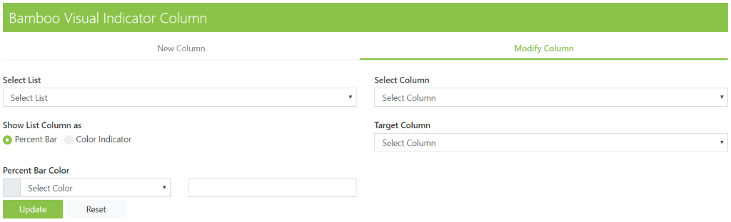
The modify column tab on your Visual Indicator Column Cloud Part® is used to quickly update any existing Visual Indicator Columns that you might have in any list in your Site Collection. The fields that you must fill out and the content that should be in them are as follows:
- Select List: This field is populated with all lists on your site collection that currently have a Visual Indicator Column on them. Select from the options the list that has the column you are looking to update or modify.
- Select Column: This is where you select the name of the Visual Indicator Column in the list, there can be more than one per list so make sure you’re choosing the right one!
- Show List Column As: This allows you to reselect how you would like the data in this column to be displayed, you can choose between Percent Bar and Color Indicator
- Target Column: This drop-down choice menu gives you a list of all the columns in the list that contain data that can feed a Visual Indicator Column. This drop-down gives you the option to change what column in your list is feeding the Visual Indicator Column from what you had previously selected.
- *Percent Bar Color: This field will only show up if you have selected “Percent Bar” in the Show List Column As field. In this field you can choose from a preset selection of standard colors in a drop-down choice field, or you can choose custom and enter the hex value of any color you would like.
- Delete: A big red button will appear in the bottom right-hand corner of the webpart once you have selected the column you are wanting to modify. This button allows you to delete an existing Visual Indicator Column. There is no way to quickly restore a column upon deletion, so make sure when you’re deleting that it is indeed what you would like to do.
Once you have updated or modified the fields you came to change, you need only click “Update” at the bottom of the Cloud Part® to apply the new changes to your list.
Comments
0 comments
Article is closed for comments.