
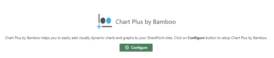
Cloud Part®
Easily add visually dynamic charts and graphs to your SharePoint sites.
User Manual
Once you have added your Chart Plus webpart to a page, select the “Configure” button to set up your webpart.
There are four tabs within the settings panel where you can set up and customize your webpart: Data Source, Chart Type, Advanced, and About.
Data Source Tab:
Chart Name: Enter the name that will appear at the top of your chart.
Source Site: Enter the URL of the site that houses the list that will feed your chart.
Load Lists Button: Click this button to load the lists from the source site, a message will appear to indicate if the load was successful or if the load failed.
Source List: Select from this dropdown the list that will feed the chart plus webpart, this drop down is populated by the source site URL.
Display Legend: Check if you would like your legend to be displayed, uncheck to not show the agenda.
Which items in the list do you want to filter?: This section allows you to filter the information from the list that will be presented in your chart
Chart Type Tab:
Chart Type: Select the chart type for how you want your data displayed, there are 8 different chart types
- Column
- Bar
- Pie
- Donut
- Line
- Area
- Scatter
- Bubble
X (Category) Axis:
Select Category Field: Choose which field will populate the x-axis
X Axis Label: Provide the label for the x-axis
Y (Value) Axis:
Select Category Field: Choose with value field will populate the y-axis
Y Axis Label: Provide the label for the y-axis
Enable Aggregation: Check this box to enable aggregation of the data, the different options for aggregation are as follows:
- Sum
- Average
- Count
- Minimum
- Maximum
Aggregate: Choose which way you would like your data to be aggregated
Column Format: Choose the format in which you want your columns to be displayed
- Single Columns
- Stack Columns
- 100% Stack Columns
- Multi-Columns
Advanced:
Settings: Use this area to further customize your webpart
Web Part Title: Change the title of the webpart from Chart Plus to something more reflecting of your organization
Do Not Show Tour Popup?: Check this box to prevent the tour walkthrough from popping up every time you open the settings panel.
About:
This section features a brief description of the webpart, the version number of the webpart you have on your tenant, and copyright information. There is also a button to initiate the introduction which will start up the “how to” walkthrough.
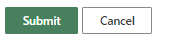
Once you have filled in all your settings, hit the Submit button to generate the webpart you designed. If you are wanting to update or modify the webpart you created, simply put your page in edit mode and select the gear icon in the top right corner of the webpart.
Comments
0 comments
Please sign in to leave a comment.