|
Instructions:
Once you have installed the Chart Plus Web Part, you can begin to use it to quickly represent your important SharePoint data through visually-appealing charts. For example, you can take a SharePoint List and represent it as a chart quickly and easily. To do this, please follow these simple steps:
Note: Use the Preview button frequently during the customization process. This will allow you to monitor the results of your changes and help you to better understand the effect that each setting will have on your chart.
- Configure the Chart Data Source:
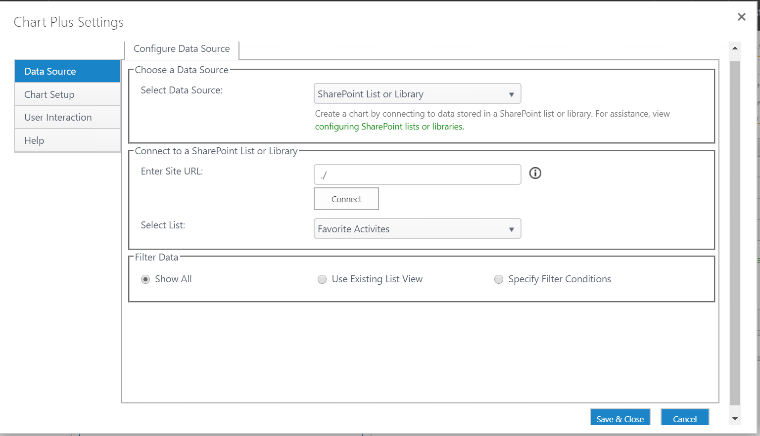
- Open the Chart Plus Web Part Settings window.
- On the left-hand menu, click Data Source. For this example, we will use SharePoint List or Library. For a detailed explanation of what data sources are supported by Chart Plus, see the online documentation.
- In drop down menu Select Data Source, click SharePoint List or Library. Enter the site URL (Relative or Absolute) and click connect. Click on the SharePoint List drop-down menu to choose a list to use.
- Choose the Chart Type:
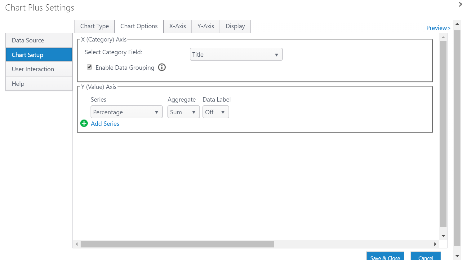
- On the left-hand menu click Chart Setup and select the Chart type, click Chart Options.
- If you selected Enable Grouping when selecting the Y-axes to display in the settings for the chart data source, you can select an operator to use to group series data. Available operators include SUM, COUNT, AVERAGE, PERCENT, and SUM_PERCENT.
- On the left-hand menu, click Chart Setup.
- Use the drop-down menu to select the Category field for the X Axis and choose to enable Grouping.
- Enter the Series, Aggregate, and Data Label for the Y Axis
- Under the Chart Configuration section, use the Chart Type drop-down menu to determine the chart type. If you selected multiple Y-axis series, you can select a different chart type for each Y-axis series.
- If you selected multiple Y-axis series, you can set whether to display each series on the Primary Y-Axis or the Secondary Y-Axis by using the Y-Axis drop-down menu. The Primary Y-Axis will appear on the left-hand side of your chart, the Secondary Y-Axis will appear on the right-hand side.
- Format the X-Axis:
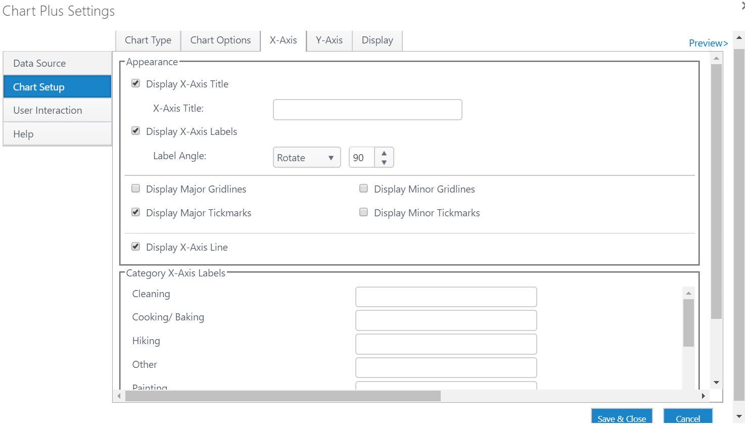
- On the left-hand menu, click X-Axis Settings.
- Type a title for your X-Axis in the Title Text box.
- Uncheck the Show X-Axis check box to hide the X-Axis and its labels.
- Use the X-Axis Value Type drop-down menu to choose a specific type of value (such as currency, percent, or a date).
- Use the X-Axis Value Rotation value to rotate the labels of your X-Axis items. Set a margin between axis labels and the X-axis in the Marginbox.
- Format the Primary and Secondary Y-Axes:
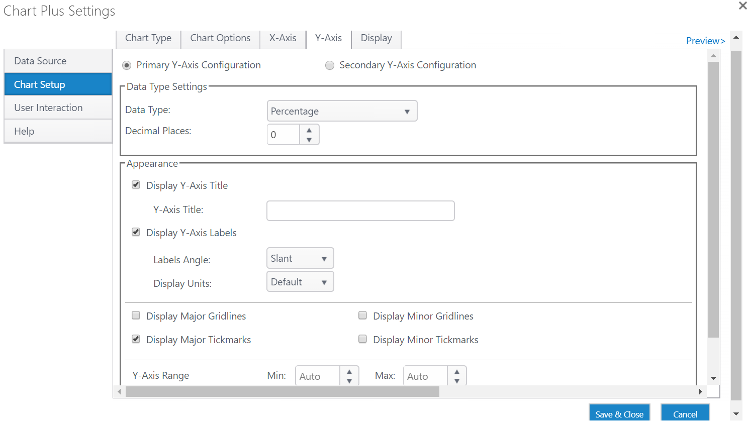
Note: The following instructions correspond to both the Primary and Secondary Y-Axes
- On the left-hand menu, click Y-Axis Settings.
- Type a title for your Y-Axis in the Title Text box.
- Uncheck the Show Y-Axis check box to hide the Y-Axis and its labels.
- Use the Y-Axis Value Type drop-down menu to choose a specific type of value (such as currency, percent, or a date).
- Use the Y-Axis Display Units drop-down menu to express your Y-Axis on a relative scale, such as hundreds or ten thousands.
- Use the Y-Axis Value Rotation value to rotate the labels of your Y-Axis items. Set a margin between the axis labels and the Y-axis in the Margin box.
- Use the Y-Axis Value Range value to enter a custom range for your Y-Axis. Enter the starting value in the Min text box and the ending value in the Max text box. You can set the interval between Y-Axis grid lines in the Interval text box.
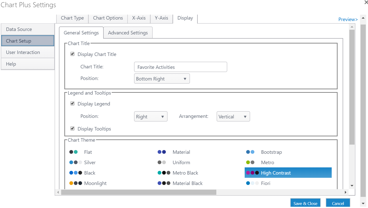
- Customize Your Chart:
- Using the Chart Plus Web Part Display window, you can customize the look and feel of your chart. Refer to the online documentation for tips on how to change the background, plot area color scheme, chart size, orientation and more.
- You can further customize chart elements, such as series color schemes, legend settings, and axis elements. To learn how, see the Chart Display Settings section of the online documentation.
- If you want to customize your chart even further, you can create a custom style sheet for your chart. On the left-hand menu, click Advanced Settings, then choose Custom Style Sheet in the Style Sheet drop-down menu.
Once you are done configuring your chart's settings, click the Save & Close button. Your new chart will appear on your SharePoint site. At any time, you can go back into the Chart Plus Web Part Settings window and re-configure the Web Part settings to suit your needs.
|

Comments
0 comments
Please sign in to leave a comment.